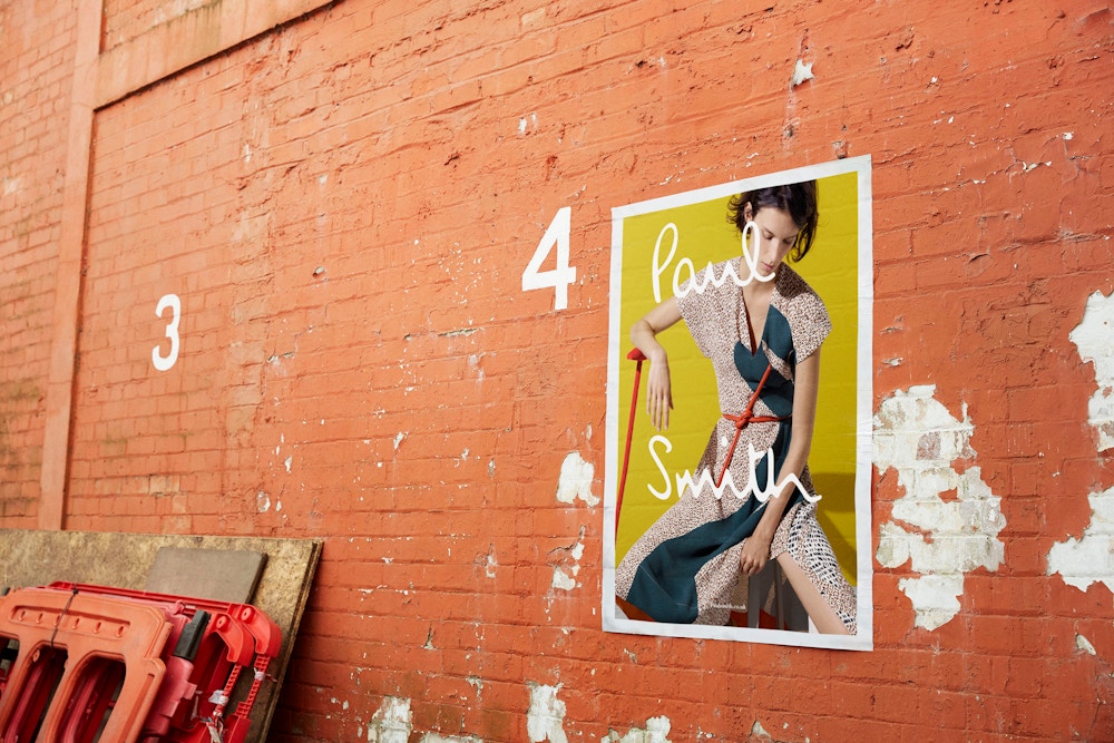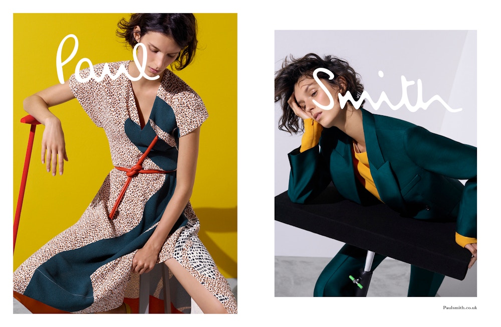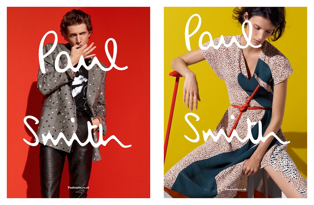
Paul Smith SS16 Campaign
Role: Design Direction
Creative Director:
Jonathan Schofield
~
Photography:
Viviane Sassen
Paul Smith SS16 Campaign
Continuing the brief from the launch of the AW15 mainline collection – to revise and bring new life to the creative direction for the company. The signature Paul Smith logo was to be re-imagined with a playful sense of scale and positioning accompanied with new a typographic direction for the brand. It was key that a sense of modernity and wit was to be present throughout the campaign, echoing the essential qualities of Paul Smith. This was the first time in the brand’s history that the logo had been featured so largely, split in half and featured as a stacked unit – something we exploited throughout the campaign and across the design direction of the company as a whole.


