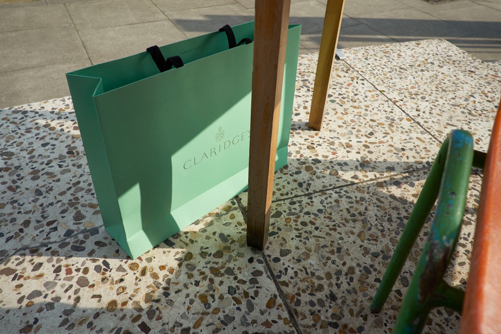
Claridge’s
Role: Lead Designer
Creative Director:
Georgia Fendley
Credit:
Construct
2010
Claridge’s
Founded in the 1800s, Claridge’s is the quintessential London luxury hotel. It began life as a single house at 51 Brook Street and over time transformed itself into one of London’s art deco icons becoming a haven for royalty and dignitaries and home to generations of hollywood actors, models, artists and musicians.
My role on the project included creating the new identity, logotype and hotel crest, signage, packaging, internal and external communications and art direction.
Working with such a time-honoured institution requires both careful historical research as well as very delicate handling of identity elements. The design team was given complete access to the Claridge’s archives, while extensive interviews were conducted with it’s current staff to obtain a greater sense of a contemporary Claridge’s. The objective was to maintain the loyalty of a large existing customer base while appealing to a new generation who value heritage, authentic experiences and exceptional services that delivery luxury. The design was successful in modernising Claridge’s brand, while maintaining its well established heritage.
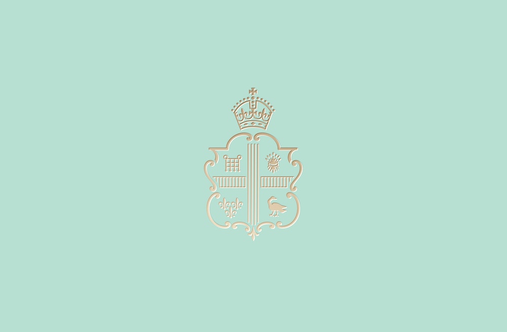

The new logotype and crest were designed to pay homage to the character of some of the early incarnations of the hotels branding from the 1920s and 30s, with their tall, sharp and clean elegance. The logotype was redrawn and based on the beautiful SangBleu created by Swiss Typefaces and was also used as the primary font for the new branding. SangBleu was chosen because it felt like the perfect analogy for the hotel, with it’s strong association with the fashion industry but also for it’s clean modernity yet nostalgic expression.
The colour palette of jade and gold were chosen to reflect Claridge’s interiors and it’s iconic Afternoon Tea service. The use of the bold black and white chevron patterns were added as an unexpected and playful dimension to the branding, inspired by the architect Thierry Despont’s bold use of black and white geometric patterns in the hotel’s foyer flooring.
The hotel had a huge number of traditionally branded items which included everything from customized porcelain, egg cups, slippers and dressing gowns. Implementing a consistent and cohesive sense of identity throughout the hotel, was key in the design development process. An important addition to the branding was to provide Claridge’s with a new tone of voice and was seen as a way to attract a new younger audience. The main outlet for this came through a quarterly magazine which, while communicating the brands confident heritage also showed that it was in-touch with current trends – be it art, entrepreneurship, fashion or design – and could be humorous and had a playful spirit.